
Re-designing the GRCOA Website
10 minute read
Team
My Role
I led user research, archetypes and
journey maps, website and mobile
prototyping, and blue-sky ideation.
Tools Used
Timeline
Nida Shanar
Isabel U-Perez
Bavneet Sandhu
Jade Weaver
Abibat Egbeyemi
Kaeleigh Gardiner
Therese Ristow
8 months (Sept 2025 - May 2026)
Figma & Figjam
Google Docs
Google Forms
Leanne Witzke
Olivia Bartlett
Mya Certossi
My team and I were tasked to help Brantford's GRCOA (Grand River Council of Aging), a non-profit organization, to design an intuitive, scalable digital solution that meets the needs of today’s 45-year-olds while evolving to support them and the community in crafting an age-friendly future over the next 20 years. 🤗
Overview
Contents
Client Project
Information Architecture
Prototyping
User Research


Testimonials
"Your thoughtful approach to developing a digital solution and enhancing our website has not only met the needs of today’s 45-year-olds but has also positioned the GRCOA to evolve alongside them. You have helped us take a meaningful step forward in supporting individuals as they age, while strengthening our ability to foster a more connected, inclusive, and age-friendly community over the next 20 years.
We were particularly impressed by your ability to blend innovation with practicality—delivering a solution that is both forward-thinking and grounded in real community needs. Your professionalism, creativity, and commitment to excellence were evident at every stage of the project."

Lucy Marco
Executive Director
Claudio Pavan
Retired Resident Member

"These deliverables and your work throughout the year has displayed the highest level of UX maturity and sophistication, which has resulted in a very valuable and impressive outcome and handoff for the client. Kudos on all of your excellent work throughout the year!"
Kenneth Werbin
UX400: Capstone Wilfrid Laurier Professor

Background
The Grand River Council on Aging (GRCOA) is a non-profit organization whose mission is to create an age-friendly community across Brantford and Brant County.


Project Objective & How Might We statement
Currently the GRCOA has:
Lack of education and awareness about aging resources and support
Risk of underutilization of services due to poor digital infrastructure
Organizational sustainability risks (funding, volunteers, outreach)
There should be:
Long-term planning for sustainability of both the organization and their resources/services for generations to come.
🎯 Main Objective:
To create an age-friendly community for all residents.

👥 Target Users:
1
2
Primary
45-55+ year olds planning for the next stage of life.
Secondary
20-40 year olds trying to build awareness around aging early on.
We created a "how might we" statement around our objective and users so we can refer back to it to keep our team focused.
Design an intuitive, scalable digital solution that meets the needs of today’s 45-year-olds while evolving to support them and the community in crafting an age-friendly future over the next 20 years?
How Might We…
Initial Client Meeting
In order to ensure our team is on the same page, we conducted a group meeting to discuss role allocation, team alignment, and team retrospective (to reflect on our previous group projects outside of this one). We also ideated any questions we had for Lucy and Claudio: executive members of the GRCOA.
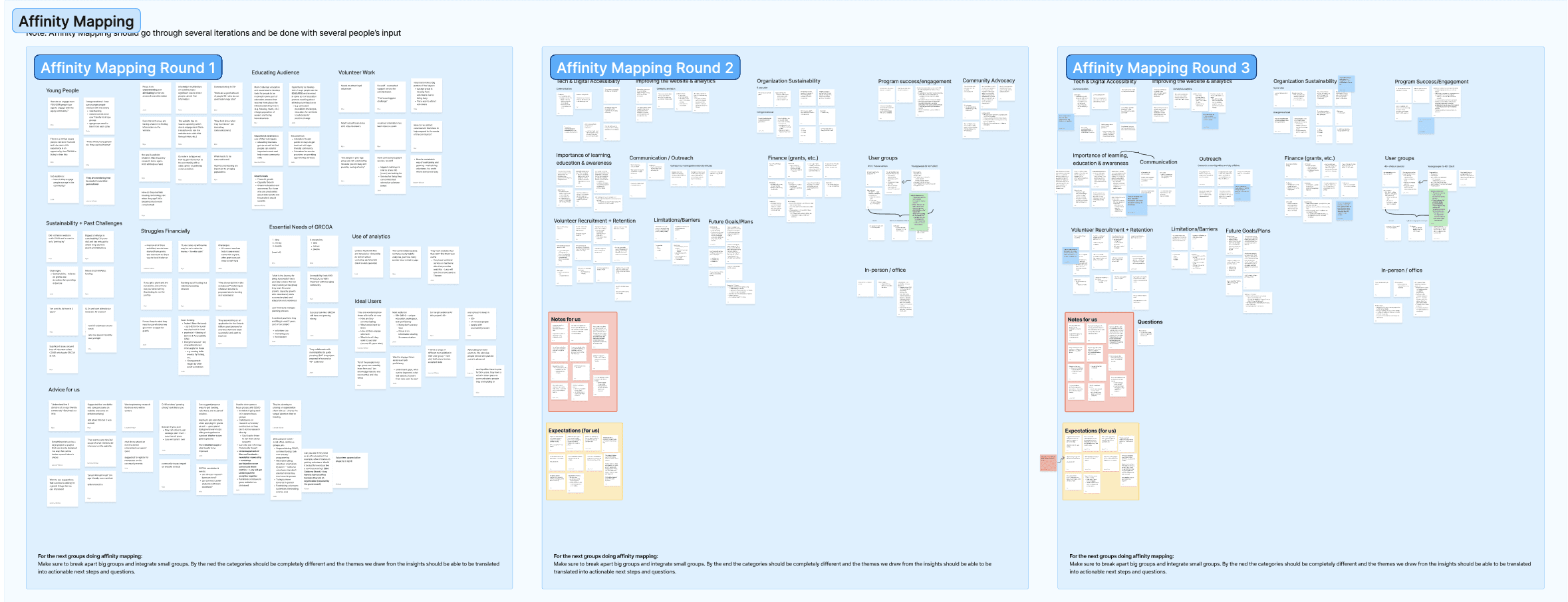
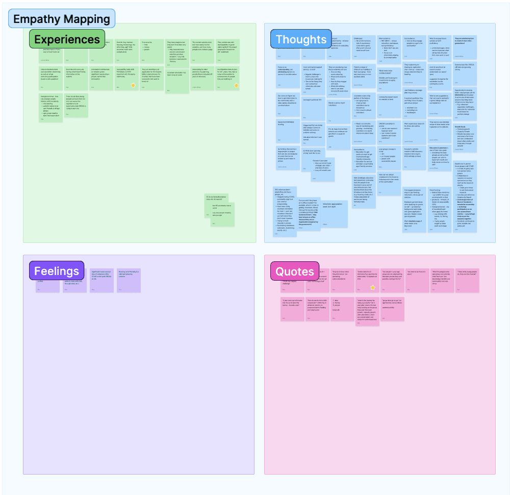
After a virtual meeting with our client Lucy and Claudio from GRCOA, we conducted 3 rounds of affinity mapping, and empathy mapping to sort through and understand the information they gave us. From this, we understood what Lucy and Claudio wanted from us, what our objectives were, and what the GRCOA provided for the Brantford community.
A main takeaway was that the GRCOA are focused on being intergenerational, meaning these tools remain relevant and user-friendly to people as they age.

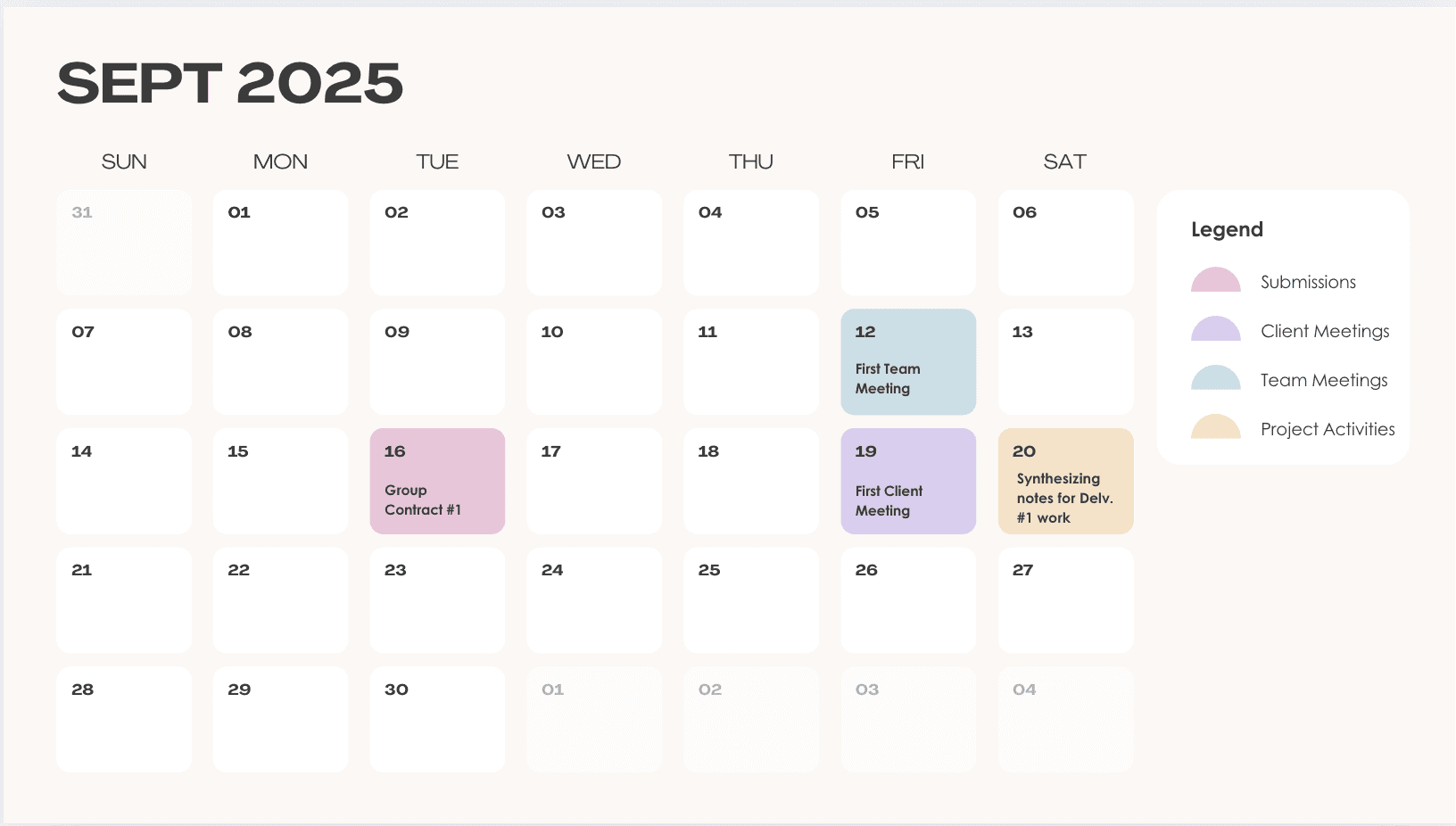
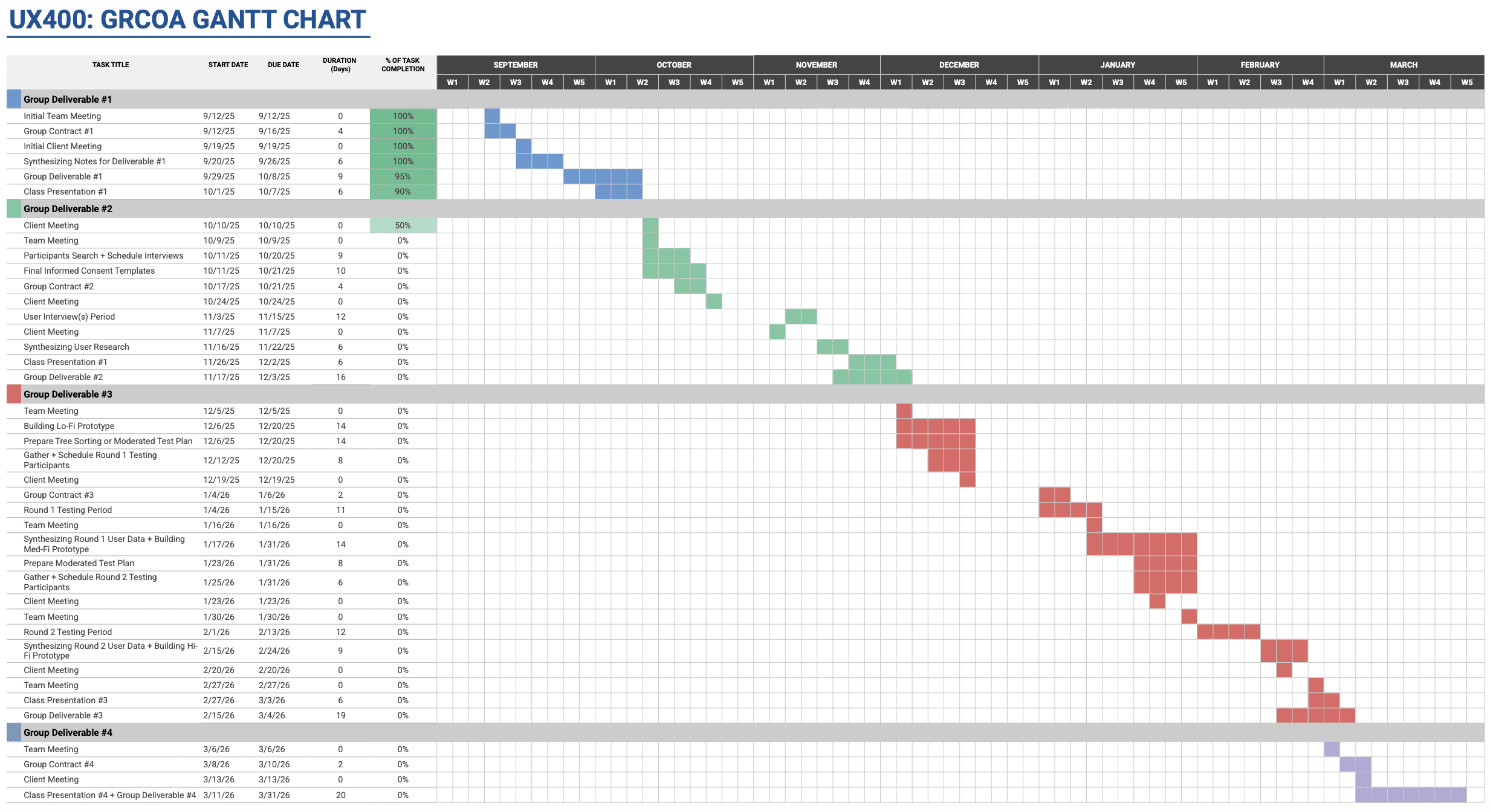
After we generated long-term planning to ensure we stay aligned. We created a Gantt chart and a 7-month calendar to clearly map out our project activities, timelines, and deliverables. Both tools will help our team prepare for any contingencies by showing us how tasks connect, when or why certain tasks can run into delays, and ultimately how we can work around them.


Comparative Analysis & Work Plan
For more details, read our full Deliverable #1 document. We presented our deliverable to our class, professor and client succinctly.
View our presentation slides below.
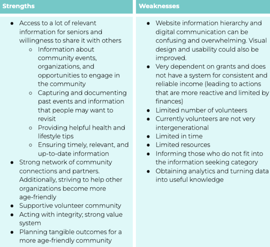
We then conducted an environmental analysis and SWOT analysis that examines current strengths, weaknesses, opportunities, and threats of the organization based on examination of internal resources, community events, website, and stakeholder information.
We analyzed 8 organizations across two categories: similar non-profits serving aging communities, and platforms actively used by our target demographic to identify content gaps and design opportunities for the GRCOA site.
-Strength: in-depth communication
User Research, Synthesis & Results
To understand our target users, our team conducted open, semi-structured interviews. Our team selected this method to get detailed information around users’ challenges, motivations, behaviours, wants, goals, and toolkit, while being able to gather initial impressions, expectations, and workflows during their walkthrough on the website.
We then created a screener survey to ensure we gathered meaningful insights based on the project’s scope, we used the following criteria to select participants:
We aimed for 15+ research participants based on recommendations by industry experts like the Nielsen Norman Group (NNG).
They suggest a minimum of 5 participants per user type to make sure there is enough data to create a well-informed persona/archetype.
Participants must be within the 40-55 age range.
Participants must be willing to share their screens during the sessions.
Participants can be from any location in Ontario.
Screener form.
Planned and scheduled interviews from screener participants.
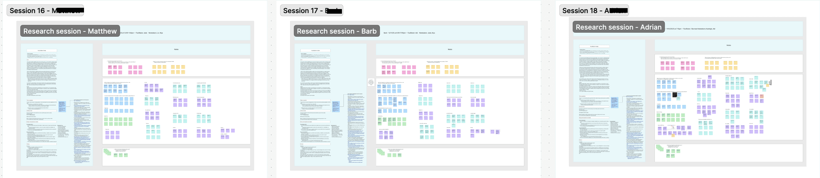
Note-taking sessions.
We successfully conducted 20 interviews with a duration of 45 minutes to an hour each.
We had a minimum of 2 note-takers and 1 facilitator for each session. During the interview process, we asked participants to screen-share the GRCOA website and show us their usual process or workflow when evaluating this online community resource for the first time.
In addition, participants were asked targeted questions related to:
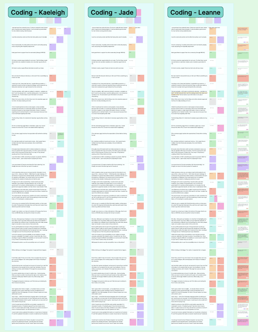
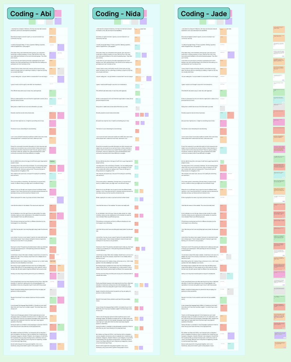
With each research session, we synthesized the information by coding it. We started by creating a codebook with labels of: experiences, preferences, wants, pain points, positives, tasks/processes, toolkit, & neutral.
We conducted 3 rounds of coding, where we labeled each line of information said by the participant.
After synthesizing, we are able to group our results into categories of what we uncovered.
Their experiences, habits, and preferences around finding and using community resources, online resources, and future planning.
Challenges or concerns they’ve encountered during these experiences.
Their wants and views on opportunities for improving these experiences.

Screener Survey
User Interviews
Interview Results


For more details, read our full Deliverable #2 document. We presented our deliverable to our class, professor and client succinctly.
View our presentation slides below.
We further affinity mapped our information into more specific categories to uncover more themes.

Archetypes & Journey Maps
Archetypes are specific representations of core characteristics and behaviours within groups of users. Journey maps are visualizations of the steps users take within a scenario to reach their goals while identifying pain points and design opportunities within those tasks.
The Optimizer values efficiency and is looking to reduce the time it takes to find information.
Focused on direct finding with limited exploration, they appreciate quick and readily available information.
The Optimizer is more concerned with minimizing browsing times and efforts. Utilizing resources like AI and search bars, they are focused on optimizing processes to find information easier. Due to this approach, they are quick to leave websites if they can’t find what they are looking for in a short amount of time.
The Value Seeker is looking for information that sparks their interest.
Research and planning are low-urgency processes for them; they explore interesting or valuable resources when an easy opportunity presents itself.
They don’t go out of their way to find new sources of information but explore them thoroughly if they come across something that seems interesting. Because of this laid-back approach, they tend to feel less prepared about their future.
Archetype + Journey Map #1: The Value Seeker


Archetype + Journey Map #2: The Optimizer


The Socializer is motivated by connection. They actively seek opportunities to meet people, participate in community activities, and stay socially engaged, whether through events, arts, gardening, workshops, or volunteering.
They enjoy both digital and in-person experiences and frequently use social media to keep up with community events. Social connection also shapes how they plan for the future.
They value staying involved, supported, and informed and see it as more important than long-term structured planning.
Archetype + Journey Map #3: The Socializer


The Skeptic is cautious when finding new information and resources.
They have plans in place and experts to contact if needs arise, and don’t feel like community resources have any personal value to them, so they feel well prepared to face any challenges that may arise.
They need and are confident in their existing sources of information if new needs arise, their online experiences are more focused on loose exploration of visually eye-catching experiences.
Archetype + Journey Map #4: The Skeptic


From our coding and synthesis, we were able to construct 4 data-based archetypes. We iterated on the grouping, labeling and descriptions of each archetype to understand where our users fit based on the data we sorted out.
Both archetypes and journey maps were synthesized based on patterns found in research findings that indicated common relationships between goals, needs, pain points, experiences, and processes for groups of users.
Storyboards & Ideation
Diverge: Create choices
Sketching storyboards individually
Reviewing user journey maps and pain points
Creating a storyline

Converge: Make choices
Pulling in ideas from individual sketches as a team
Coming up with rationale for story choices
Finalizing storyline, emotions, art-style & graphics


Diverge and Converge Ideation
During the ideation process for the storyboards, our team used divergent and convergent thinking methods.
Using divergent and convergent thinking, team members sketched storyboards individually to avoid bias, then came together to combine the strongest ideas into 3 final storyboards aligned with our research findings and HMW statement.

→
Final Storyboards
Storyboards #1:
Storyboards #2:
Storyboards #3:


Constraints
The following outlines the specific constraints that influence what our team can design, recommend, and deliver for GRCOA.
In general, these constraints consider the capabilities of GRCOA, our team, and the users. By identifying these factors, it can help ensure our design recommendations remain practical and user-centered while aligning with the organization’s needs.
Due to these client constraints, our team will need to evaluate:
Affordable tools, services, hosting, and maintenance options that GRCOA staff can easily manage without ongoing external or developer support.
Cost-effective, scalable, and maintainable recommendations within GRCOA’s financial capacity.
GRCOA’s operations depend on funding through donations and/or grants which affects what our team can implement in the website re-design.
Budgetary Constraints

Our website re-design needs to be compatible with the current platform host to:
Ensure familiarity.
Continue being managed without a deep level of technical expertise.
GRCOA does not have a team of developers and our team must account for platform limitations.
Technological Constraints

To accommodate, our team needs to account for the following in our website re-design:
Accessibility
Intuitive navigation and simplicity
Responsiveness on mobile devices
Efficiency and attention span
Reliance on social sharing behaviors for information
GRCOA caters to a diverse user base such as seniors, caregivers, community members, and others who may not be as technologically savvy.
User Constraints
Low-Fidelity Testing: Open Card Sort
Following guidelines from industry experts like Nielson Norman Group, we conducted the Card Sort with a total of 9 mixed participants (5 returners and 4 new).
This is done to better understand our target users' mental models, as well as expectations in relation to site navigation and information structures.
Our team conducted an Open Card Sort for our first round of testing. Using this methodology, we were able to examine how users organize and label content from the GRCOA website without any limitations or predefined categories. We used a free online tool called Lyssna.
An Open Card Sort allowed us to evaluate common groupings and terminology and understand where multiple users may be uncertain about content or labelling.
Card Sort Results

Implementing card sort results into IA (information architecture)
Now, we implemented our card sort results into new IA (Information Architecture) for the site through brainstorming and organizing how the new GRCOA navigation bar menu will look like.


The results of the card sort helped reveal several trends and common patterns among users for labelling and content grouping.

Low-Fidelity Prototypes
Following the test results, our group came together to confirm the final IA (information architecture) of the GRCOA website based on the results.
With this, several pages that had common groupings like ‘About’ and ‘Events’ would have minimal changes for the broader category labels.
Looking at the results, our team proposed new labels for other high-level content categories that better aligned with user mental models and expectations. These include:
About Us
Events
Volunteer
Resources & Services (new)
Community Planning (new)
Contact Us
These new groupings based on results are a consolidation of related pages. We believed this was the best decision moving forward as it allowed for a reduction in the number of pages that will be shown on the GRCOA website.
We also referenced our previous generative research alongside the card sort results to propose lower-level changes to content, groupings, and labelling within our initial low-fi designs. These changes include combining pages and content that were often grouped together by users, adding local navigation, and adjusting subcategory labels that did not align with user expectations. In following their mental models, our team hopes to reduce confusion while users navigate the new and improved website.


Low-fidelity homepage.
Low-fidelity Discounts page.
Low-fidelity Search results page.
Low-fidelity Resources and Services page.
Low-fidelity Events page.
Low-fidelity Volunteer page.


Mid-Fidelity Prototypes
Building off our low-fidelity prototypes, we created more fleshed out mid-fidelity prototypes. We focused on critical tasks and workflows in this prototype, saving less vital site pages and blue-sky proposals for later iterations.

Navigation Bar
Home

Events

Workshops

Resources and Services

Volunteer Page


Health & Wellness
Mid-Fidelity Prototype Usability Testing
The new design was positively received. Participants had little to no issues with navigation and finding information, and compared the new layout favourably to the current live site, noting information was easier to find and pages more visually appealing.
Usability Test Results


Ease of use rating (on a scale of 1-5, with 1 being very difficult and 5 being very easy)
Confidence rating (on a scale of 1-5, with 1 being not confident and 5 being very confident)
Success and error rates

Participants
Following the creation of our low and mid-fidelity prototypes, we conducted moderated usability testing on our mid-fidelity prototypes.
Focusing on a smaller participant pool to allow for longer sessions and more in-depth tasks, we tested with 4 participants. This sample size is enough to provide sufficient feedback about the design, and is in line with industry recommendations. Sources indicate that 5 participants usually provide the maximum benefit-cost ratio (Neilson Norman Group), and having fewer participants makes conducting multiple rounds of testing more feasible.
Our primary goal was to uncover pain points and confusion related to key interactions, navigation labels, and the overall workflows. During testing, we were also evaluating the effectiveness of the new navigation structure created based on the Open Card Sort result findings.
Using a scenario-based approach, participants interacted with a Figma prototype, completing four scenarios, each consisting of 4 tasks.
The tasks were designed to explore key workflows across the user archetypes our team developed based on research findings. These scenarios and tasks guided users through realistic use cases which allowed us to evaluate how effectively they could accomplish key tasks on the GRCOA website.
Following each scenario, participants were asked follow-up questions related to their overall experience, any challenges, thoughts on the new interface design, as well as their overall expectations. Moreover, in addition to the qualitative feedback, quantitative metrics were collected for each scenario.
Tasks and Scenarios
Quantitative Metrics included:
Task Success and Failure Rate
For each task, the number of errors, ease of use, confidence, and success ratings were recorded. Overall, users made very few errors, with the average number of errors per task being less than one. Additionally, confidence and ease of use were both rated highly, with an average rating of 4.94/5 and 4.87/5 respectively. The success rate was also very high, with 100% of tasks being completed successfully, and an overall score of 93.5% which accounted for some tasks being completed successfully but with difficulty.
Next Iteration
Based on our analysis of usability test results and users’ friction points, we prioritized findings by frequency and severity to identify common errors and propose targeted solutions.

High-Fidelity Prototypes
Developed and refined based on insights gathered from our mid-fidelity tests, our high-fidelity prototype includes several changes related to key visuals and functional improvements to better align with the findings we uncovered. In addition to the changes described in the section above (Mid-Fidelity: Next Iteration), we also refined several elements from mid to high-fidelity:
New branding for the footer, header, buttons, and element colours to align with GRCOA’s existing green and navy theme, but with a more subtle and less overwhelming use of colour
Added icons and images (images provided by Lucy and the GRCOA)
Improved button colouring for visual clarity and consistency
Streamlined interactions, adding fuller functionality with components and variables
Applied scrolling and animations where applicable
Navigation Bar
Resources and Services
Home
Events
Discounts & Local Nav
Past Workshops


Volunteer

High-Fidelity Usability Testing
For our second round of high-fidelity testing, we selected 5 new participants from our generative research pool to ensure fresh, unbiased insights. Success rates increased across all 4 repeated scenarios, and qualitative feedback was significantly more positive, issues raised in previous rounds no longer appeared. Minor dips in ease-of-use scores were expected, as high-fidelity prototypes allow users to freely explore incorrect pages in ways mid-fidelity testing doesn't permit. Overall, results confirmed that our design changes meaningfully reduced confusion and improved the experience.
In terms of qualitative feedback, participants reported fewer points of confusion or uncertainty within the design than previous rounds of testing. The main points of friction that emerged were:
Based on the qualitative feedback and points of error during testing, we identified a few key elements in our task workflows for events, volunteer, and the global navigation that needed to be adjusted. Additionally, we mapped a few minor features such as additional print functionality and removing additional steps from link sharing that will help improve the efficiency of certain task flows.


Confusion around event registration requirements.
Differences between virtual and in-person events
Confusion around how to access the global navigation parent pages
A lack of ability to apply for a specific volunteer position from the relevant information card
Quantitative Metrics

Qualitative Metrics
Final Design
Our final prototype includes full functionality and interactions for navigating between pages and accessing content.
This final prototype is a culmination of all our research, with our solution focusing on a simple, intuitive, and scalable design that is easy to expand while remaining useful and efficient for future users.
Home
Search Results

Newsletter

Community Planning

Resources and Services


R&S local navigation bar
Events
Past Workshops


About Us
Volunteer

Donate


Contact Us


Blue-Sky Design & Ideas
Mobile App
Chatbot/AI
Social and Skills Exchange Programs
Social Media
These designs use the same components and layouts as mobile web, just scaled to fit the smaller viewport. Mobile apps allow for more customization, personalization, and flexibility than a web-based platform, as they do not rely on caching data on a web browser. This allows us to focus on providing unique and valuable features to users, such as the ability to create custom collections of resources, add friends, and document their community involvement.
Users can search within the search bar and see AI overview results
AI results are based on user data (age, what they click on or have saved in the past), so results are more accurate and personalized
Allows users to gain direct answers
Users can ask the AI Chatbot widget questions
Can help them with answering general questions and navigation with no matter where they are on the website
Based on direct user insights:
~35% of users use Artificial Intelligence (AI) search engines/summarizers to reduce the effort needed for reading, finding links and sources, etc.


We recommend exploring social mentor and skills exchange programs as a new type of event or online program to help people in the community build connections and learn new skills. These can be integrated into the Events sections of the website or primarily marketed through social media. These types of programs align well with the social focus that arose during testing, and could provide community members with more opportunities to share areas of interest and expertise, creating a connection point between many of our archetype.


Caption uses emojis and breaks up the wording for better legibility
Instagram polling feature can be used to garner feedback from users.
Q&A or advice video from a senior/mentor using the reels feature. Meant for longer-form, high attention-seeking content
Form link can be used to re-direct users to forms and adjacent outside links.


Based on research showing users rely heavily on social sharing behaviours, we recommended Instagram and Facebook to increase community awareness and event engagement. Instagram targets a younger 20-30 demographic while Facebook aligns with our 30-60 primary audience, both support direct feedback, polling, and link sharing to reach users where they already are.
Accessibility Audit
In order to ensure accessibility is being considered on the website (as the original site included an extensive accessibility button), we made a checklist for accessibility. We used WCAG standards, AODA Standards and Nielson Norman group to help determine criteria to check-off for our designs. We hope GRCOA will be able to continue following accessibility standards as our re-design is mostly accessible. We hope GRCOA will improve upon the categories that don't fully meet standards.
Accessibility compliance meter for several areas.


Checklist sections for each sub-category. Most accessibility conditions are fully met except "accessible names", "forms" and "recognition and recall".
Documentation for Developers & Web Designers

In order for the GRCOA's volunteer web developers and designers to understand how to implement our designs onto the site, we created a documentation guide.


Colour and text styles, design system.
Padding and spacing pixels for homepage.
Search bar results flow documentation.
What I learned
Managing a large team across an 8-month client engagement taught me how to navigate differing opinions while keeping work grounded in research. When project scope expanded mid-way, I learned to reframe constraints as design briefs rather than blockers. I deepened my ability to analyze research and iterate through multiple rounds of prototyping and testing, and walking away with a real client testimonial confirmed that rigorous process leads to outcomes that actually matter.

Final in-class presentation!!!


You've reached the end! Thanks for taking a look 👀
2026 ©️ Nida Shanar
You've reached the end! Thanks for taking a look 👀
2026 ©️ Nida Shanar